

Fighting fears with fun
The importance of human connection in a non-human space

New technologies have an image problem.
Brilliant?Yes.
Useful? Absolutely.
Intimidating, confusing, a little cold? Also yes.
Every so often, design steps in to soften the edges and make new technology feel human. Whether it’s a new interface, a totally unfamiliar workflow, or a tool that behaves in ways people can’t quite see yet, design adds the warmth that technology doesn’t naturally possess.
Humans are remarkably consistent in one way: we respond emotionally before we process rationally. That’s why fun (despite its playful reputation) is such a powerful design tool. It gives personality to things that aren’t human, and suddenly people don’t just use technology, they connect with it.
We Treat Machines Like People (Even When We Don’t Mean To)
In the 1990s, researchers Byron Reeves and Clifford Nass conducted what became known as the Media Equation study. Their finding was surprisingly simple: people treat computers like people, whether they intend to or not.
Whether we’re apologising to a crashed computer, or minding our manners around chatbots, our behaviour isn’t irrational; it’s instinctive. We’re always scanning for social cues, and when a computer offers even a small hint of humanity: an emoji, a wink, a responsive flourish, we mirror it.
Design that recognises this tendency makes technology feel less like machinery and more like something we can relate to.
Making the Digital Understandable
When Susan Kare joined Apple in the early 1980s, she wasn’t designing for engineers, she was designing for everyone else. Her icons for the first Macintosh GUI turned code into conversation: folders, trash bins, happy computers.
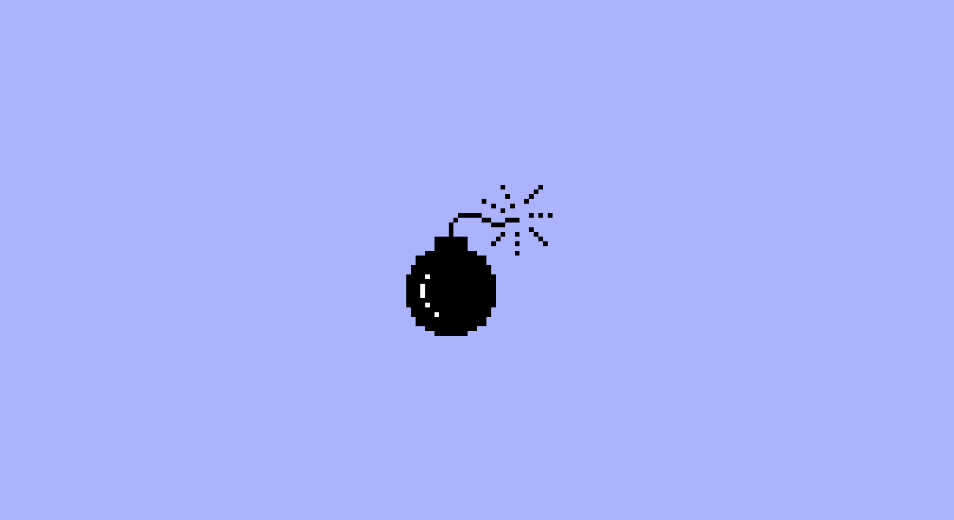
Take the bomb icon. A system error could have displayed a string of diagnostics or a diagram of whatever circuitry had given up. Instead, users got a tiny, cartoonish bomb—irrelevant to the cause, but perfectly in tune with how the moment felt. Something went wrong. Things are about to blow up. It was emotional truth, not literal accuracy. (Here’s more from Susan Kare about her work on the project)
And it wasn’t just the bomb. The early GUI borrowed liberally from the physical world: documents, desktops, paintbrushes, folders, bookmarks, and of course the trash can. Still perched in the corner of Mac docks today. This approach echoes Jakob’s Law: a UX principle stating that people expect new systems to behave like the ones they already know. When interfaces use familiar metaphors, they don’t just feel intuitive; they lower cognitive load and make the unfamiliar instantly legible. By grounding the digital in the physical, Kare removed friction. Because when things make sense, they stop being scary.
Her work showed that friendliness isn’t something added after the functionality—often, it is the functionality. It shapes how we navigate, learn, and build trust in unfamiliar spaces.
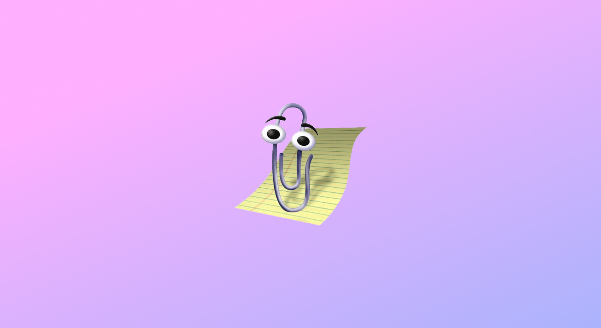
A Paperclip with Personality
Then in 1997, along came Clippy.
Clippy was ambitious, maybe too ambitious for the Windows 98 world he was born into, but he represented something important. He wasn’t a button or a menu, he was a character. Animated by former Disney artists, given stage directions, and designed to feel like the world’s most enthusiastic (and slightly overeager) office mate.
Was he perfect? Absolutely not. Was he wrong? Also no.
Clippy proved that personality sticks. That people remember interfaces with feelings. And if you add a bit of fun to routine tasks it becomes something people bond with (even decades later, when the nostalgia hits and suddenly everyone loves the little guy again). And now Microsoft has picked up the thread once more with their AI assistant Mico — a modern take on the same instinct to give tech a tiny, trustworthy face.
Making the Invisible Understandable
Modern tools are fast, capable, and often “think” in ways users can’t see. That’s why the way a product presents itself matters. Small human cues like progress animations showing “thinking time”, a familiar visual metaphor, some friendly microcopy like “All done!” instead of “Operation successful”, anchors interactions in something recognisable and relatable.
These cues don’t just decorate or distract; they give people the confidence to explore. and turn invisible processes into more enjoyable experiences.
Fun Isn’t Frivolous - It’s Functional
It’s how design lowers our guard long enough for learning, curiosity, and creativity to take root. Without warmth, innovation can feel like intrusion. With it, technology becomes a place we’re willing to step into.
So whether it’s a smiling Mac in 1984 or a chatbot today, the principle stays the same:
design’s most powerful move is making the future feel friendly.