

Design got safe - type can fix it
Why the future of design depends on giving words their voice back

Wikipedia calls typography “the art and technique of arranging type…” — which is true, it’s just missing a pulse.
In reality, it’s the voice. The attitude. The thing that makes words feel like something.
Take the simplest example: “Sale Now On.”
Printed in Helvetica Black, it feels corporate and mass-produced. Hand-painted on cardboard, it feels human and urgent. Same words, different treatment, completely different emotion.
Typography is everywhere: street signs, memes, protest banners, government leaflets, TikTok subtitles, even your Wi-Fi router label.
If design had a bloodstream, typography would be the oxygen — the thing that keeps it alive.
If everyone’s using the same typefaces, where does originality come from?
The illusion of choice
So why does so much of it look the same?
Helvetica. Futura. Whatever’s hot on Google Fonts.
The democratisation of design tools has made type accessible to everyone. That’s a good thing — creativity shouldn’t be gate-kept — but it’s also created a new kind of conformity. When anyone can open Canva or download the same free libraries, the edges that made visual language distinctive begin to blur.
We pretend it’s choice, but it’s really mass-produced personality.
If everyone’s using the same typefaces, where does originality come from?
(Quick note: a font is a style; a typeface is the family. Arial Bold is a font, Arial is the typeface. Use that trivia responsibly.)
How technology shapes taste
Typography has always evolved alongside technology:
Stone carving → Hieroglyphs
Porcelain Type → Movable printing
Industrial production → Letterpress
Dry transfer → Letraset
PostScript → Desktop publishing
Internet → Font libraries
Every leap made type more accessible — first came a burst of creativity, then a wave of sameness.
When printing became cheap, posters flooded the streets. When desktop publishing arrived, we all discovered Comic Sans. Now, the internet has given us endless libraries but narrowed how we use them.
Platforms like Google Fonts, Behance and Pinterest have levelled the playing field but also compressed diversity. When designers scroll the same feeds and download the same fonts, even rebellion starts to look standardised.
The logic is always the same: clarity, scalability, legibility online. It makes sense on paper, but it’s left the visual landscape eerily uniform.
And that sameness doesn’t stop at independent designers
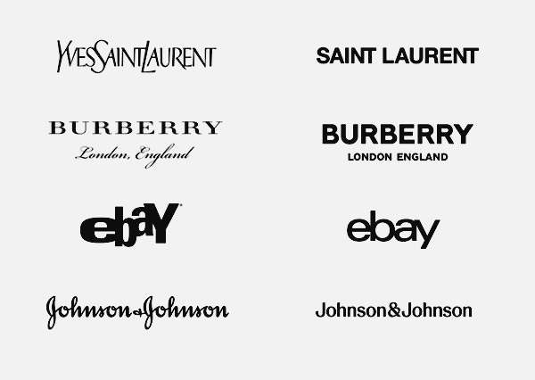
Think of Burberry, Johnson & Johnson, Ebay or Yves Saint Laurent — all recently flattened their wordmarks into neutral sans-serifs. The logic is always the same: clarity, scalability, legibility online. It makes sense on paper, but it’s left the visual landscape eerily uniform. This drive for simplicity has earned its own name — “Blanding.” Clean, calm, and instantly forgettable.
We’re drowning in visual noise, but the voices are getting more generic.
Burberry recently rebranded away from there neutral version, less than five years after launching it, which shows how personality is important and what seems logical for the modern infrastructure of brands loses the hearts of those who it, ultimately, is for.
The fix? Stop choosing type. Start making type — and make it interesting.
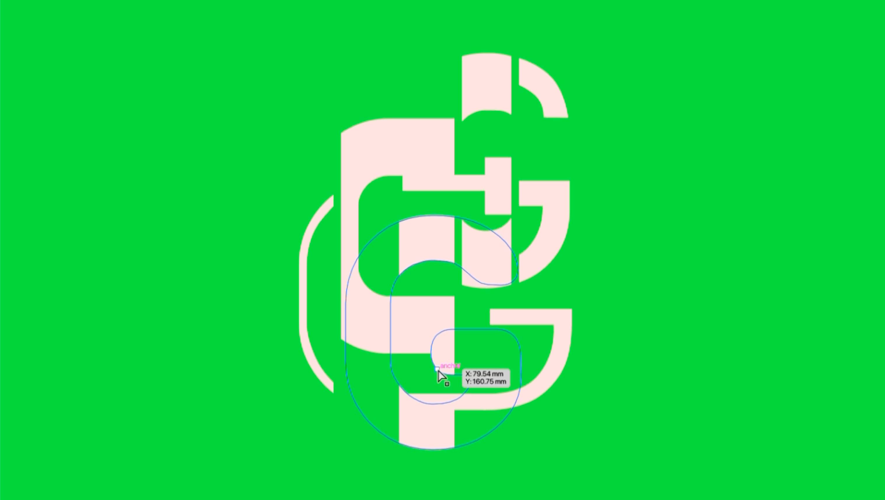
Custom typography isn’t a luxury. It’s a strategic tool. It builds recognition, ownership and distinction directly into the letters themselves. A bespoke typeface becomes a living part of a brand system — it can flex across languages, adapt to digital motion and still remain unmistakably “you.”
Changing letterforms isn’t cosmetic; it rewrites the DNA of a message.
Yes, budgets and deadlines exist. And yes, making a full font is a commitment.
But you don’t always need a full font — a custom wordmark, a tweaked glyph, even one modified letter can change everything. It’s that spark of uniqueness that separates design from decoration.
At AoN, we use it constantly — not as decoration, but as behaviour:
Urban ReLeaf — a wordmark that grows like plants and softens the edges
Dundee Design Festival — full variable typeface powering everything, from print to motion to the installations
V&A Dundee (Plastic: Remaking our World) — pushed the playfulness of their new typeface into the exhibition’s voice
Our own studio font — versioned like software, never static, always evolving
Custom type isn’t styling — it’s how you put your identity into the alphabet itself.
What’s next?
If type always shifts with technology, the next era maybe isn’t more fonts — maybe it’s new behaviour.
Variable fonts, kinetic identities and AI-assisted tools are already blurring the lines between letterform and movement. Type no longer has to sit still; it can flex, respond, and evolve with data, sound or interaction.
We’re seeing:
Type that moves, reacts and glitches
Variable axes for mood, energy, or personality
Letterforms that redraw themselves
Hybrid alphabets combining emoji, icons and symbols
AI-assisted type design — the craft stays human, the labour doesn’t
Type as software: alive, responsive, never finished
The alphabet is no longer a fixed set of shapes.
It’s becoming motion, code, personality and system.
The people who get this will sound like they belong to now.
The rest will still be downloading Top 10 Free Fonts for 2025/26/27…