

Accessibility isn't black & white
Why colour contrast is trickier than you think.


It’s 1970s California, palm trees sway in the breeze and the handlebar moustache is alive and well. Disability activists in Berkeley are planning to take action into their own hands. Rolling into the streets at night with hammers and concrete to reshape pavements.
Those first drop kerbs were tiny pieces of rebellion, barely a metre wide but they changed how cities were built. Over time, they became law and then they started appearing everywhere.
The actions of a few students had a much greater impact than expected. People who’d never thought about accessibility began to benefit from it — parents pushing prams, travellers hauling suitcases, kids on scooters, delivery drivers with heavy parcels.
A solution designed to transform the lives of a minority, led to improved lives for everyone. (If you want to hear the full story, 99% Invisible has an excellent episode on it)
Accessibility is not about compliance checklists or perfect ratios. It’s about removing friction. Making movement, digital or physical, feel effortless.
When we raise the standards of accessibility on the web, the experience improves for everyone. Pages become easier to read, buttons easier to click, journeys easier to follow. The internet becomes a little smoother for all of us.
Since those nights in 1970s California, accessibility has become part of our everyday vocabulary.
It’s written into policies, briefs and brand values.
But when it comes to the web, the word often gets used more than it gets understood.
“We need the website to be fully accessible.”
A statement we see time and again in briefs and requirements. A great intention but an impossible goal.
Not because people don’t care.
Not because designers aren’t trying hard enough.
But because accessibility isn’t binary.
It’s a range of decisions, priorities and compromises that move with every project, platform and person.
Ironically, accessibility lives inside a mountain of documentation which can make it tricky to get your head around. The web’s rulebook is called the Web Content Accessibility Guidelines, or WCAG — “wuh-cag,” if you ever need to say it out loud. It’s created by the World Wide Web Consortium (W3C), the same people who keep the internet running smoothly.
The latest version, WCAG 2.2, sets out 86 success criteria, from colour contrast and captions to navigation, touch targets and error messages.
Each one is a small, measurable way to make the web easier to use for more people.
Each of the 86 criteria has a level — A, AA, or AAA. The criteria for A are basic, AA criteria are what most sites aim for and AAA are used primarily for government or public service websites where accessibility is essential.
The more criteria you want to meet the more time and effort is required when designing and building web content. So when someone asks for a “fully accessible” website, our job is to create one that works well for as many people as possible — thoughtfully, sustainably, and within the realities of the budget.
As a studio we have created a baseline of criteria we work to for each of our web projects. There are too many to cover in this edition but let’s start with colour contrast. One of the simplest accessibility checks to understand, and one of the easiest to get wrong.
Colour contrast is about the difference between text and background. In its simplest sense, more contrast = easier to read. Less contrast = things blur together.
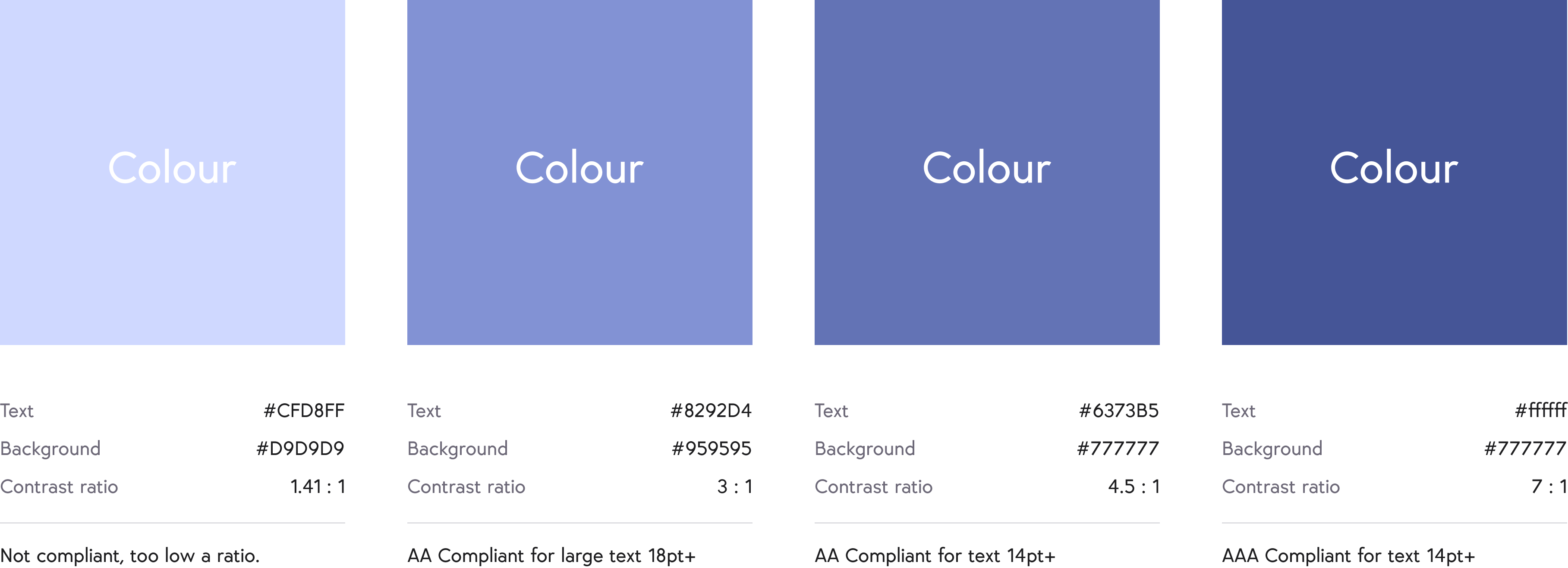
WCAG sets minimum contrast ratios between text and its background needs to meet at least 4.5:1 for AA, or 7:1 for AAA. To add a little more complexity it also varies for different text sizes. Large text (18pt+) can be slightly lower at 3:1 ratio. There are many tools on the web to check your colour contrast and see if it is compliant. ( This is one of our favourites colourcontrast.cc )
Perception also plays a part. What looks readable to one person can be almost invisible to another — depending on their eyesight, screen brightness, or even the light in the room.
Designers navigate this trade-off on every project balancing visual harmony and style with legibility. Subtle, stylish palettes often fail the test, while “accessible” combinations can look harsh or unbranded. Finding the sweet spot to work for both is what makes colour contrast such an interesting design challenge.
So what does a compliant colour combination look like and how easy is it to spot one that would fail?
We thought we’d turn it into a game.
Blocks of colour fall from the top of the screen. Some meet the contrast standards; others don’t. Your job is to remove the ones that fail before they hit the bottom. It sounds simple — until you realise how hard it is to judge the difference at speed.
Try it for yourself →
Every designer works within constraints and accessibility is another key layer of the design process. We’ll be covering more features and how to work with the WCAG criteria over the coming weeks because once you understand the nuance and complexities you can make it work for any project.